
In this project, I built a complete analytics workflow — from raw data storage in the cloud to interactive dashboards — using GCP, BigQuery, dbt, and Power BI. The goal was to demonstrate not only how to visualize data, but how to model, validate, and organize it properly along the way.
This post walks through each stage of the project and the reasoning behind the design choices.
Raw Data Ingestion and Cloud Storage
The project starts with raw operational data related to:
- sales
- stock levels
- products
- stores
Instead of loading data directly into analytical tables, I first created a dedicated Cloud Storage bucket on GCP to store the raw CSV files. This raw layer acts as a source of truth, preserving the original data structure and allowing reprocessing if needed.
From there, the raw data was loaded into BigQuery, forming the raw dataset. At this stage, no transformations were applied — the focus was purely on safe storage and accessibility.
This separation between raw and transformed data is essential for traceability and reproducibility in analytics projects.
Analytics Engineering with dbt and BigQuery
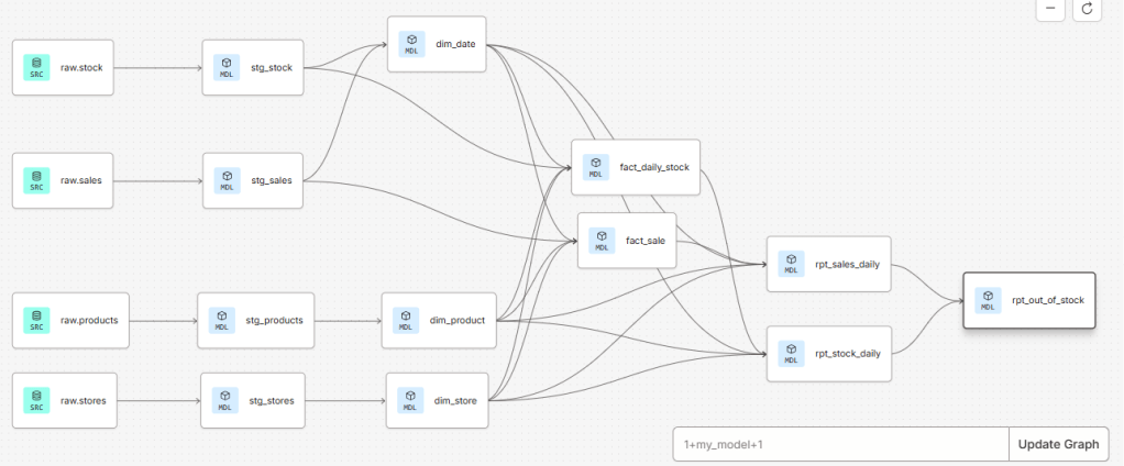
With the raw data in BigQuery, I connected dbt to the warehouse and structured the project following common analytics engineering conventions.
Staging Layer
The first transformation layer was staging.
Here, each raw table was cleaned and standardized:
- consistent column naming
- basic type casting
- removal of technical inconsistencies
Staging models act as a clean interface between raw data and downstream logic. They are intentionally simple and predictable.
At this stage, I also introduced data quality tests, including:
not_nulltests on primary identifiersuniquetests to validate primary keys- relationship tests to ensure referential integrity between entities
These tests ensure that assumptions about the data are enforced early and automatically.
Dimensional Modeling: Facts and Dimensions
From the staging layer, I moved into the marts layer, where the dimensional model was built.
Dimensions
I created core dimensions such as:
dim_productdim_storedim_date
The date dimension was generated explicitly to support time-based analysis and ensure consistent calendar logic.
Instead of relying only on natural IDs, I introduced surrogate keys for the dimensions. This allows:
- stable joins
- future support for Slowly Changing Dimensions (SCDs)
- clearer separation between business identifiers and analytical keys
Primary key tests (not_null, unique) were applied to all dimension keys.
Fact Tables
Two main fact tables were created:
- sales events
- stock events
Each fact table represents daily activity, linked to the dimensions via surrogate keys. This structure follows a star schema, optimized for analytical queries and BI tools.
Relationship tests were used to validate that every fact record correctly links to existing dimension records.
Reporting Models for Analytics and BI
On top of the fact and dimension tables, I created a reporting layer with business-focused aggregates:
rpt_sales_dailyrpt_stock_dailyrpt_out_of_stock
These models answer specific analytical questions and are designed to be BI-ready:
- consistent grain
- clear metrics
- minimal ambiguity
The rpt_out_of_stock model combines stock and sales data to identify:
- days when products were unavailable
- prolonged out-of-stock periods
- out-of-stock rates that can be analyzed by product, category, city, or state
At this point, dbt materializes these models as tables in BigQuery, creating a clean interface between the warehouse and visualization tools.
One of the main advantages of building models in dbt is the ability to maintain a clear and well-organized project structure. dbt automatically builds a Directed Acyclic Graph (DAG) based on model dependencies, which allows us to easily track data lineage, understand how models relate to each other, and reason about downstream impacts when changes are made.
Power BI: From Models to Dashboards
The reporting tables in BigQuery were then consumed directly in Power BI using an import connection.
Because the data was already properly modeled, the Power BI layer focused on:
- defining reusable measures (revenue, units sold, out-of-stock rates)
- building a clean star schema in the BI model
- creating visuals that support exploration and storytelling
Power BI was used purely for visualization, with all transformation logic handled upstream in the data warehouse.
Dashboard 1: Regional Performance Analysis
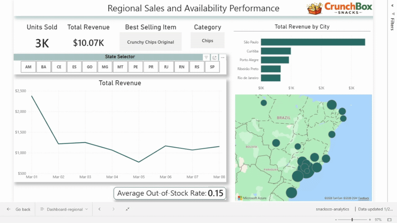
The first dashboard focuses on regional performance, driven by a state selector.
It includes:
- total revenue
- units sold
- best-selling product
- best-selling category
- revenue over time
- out-of-stock rate
- total revenue by city
This dashboard allows users to compare states, identify regional patterns, and quickly spot areas with strong performance or availability issues.
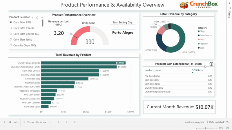
Dashboard 2: Product Performance and Availability
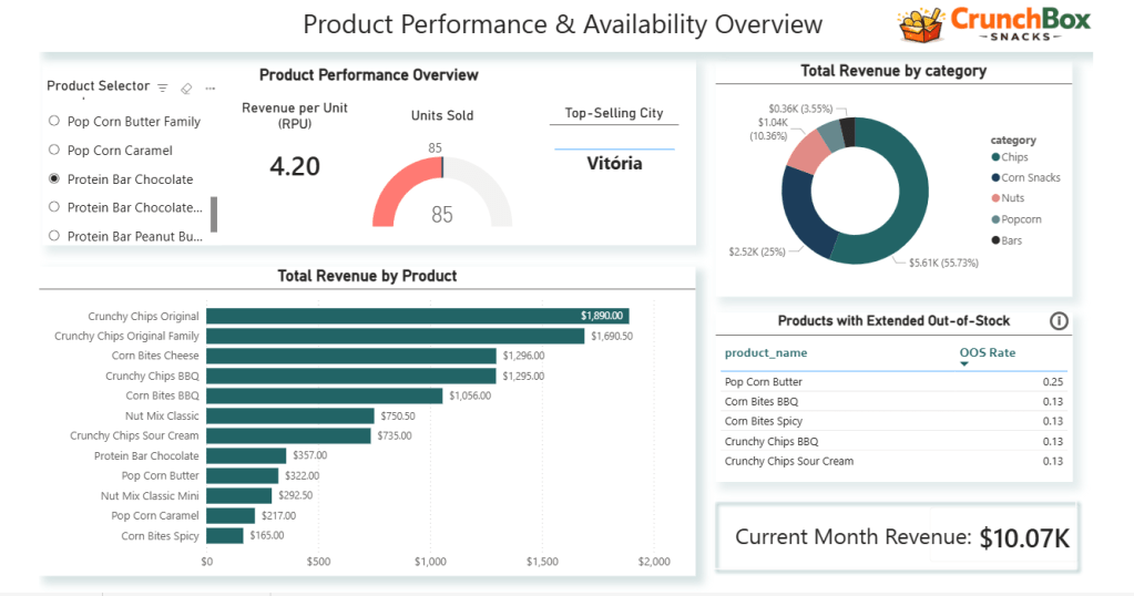
The second dashboard shifts the focus to products and categories.
A product selector dynamically controls:
- units sold
- revenue per unit
- top-selling city
The dashboard also includes:
- total revenue by product (bar chart)
- revenue share by product category (donut chart)
- a table highlighting products with the highest out-of-stock rates
- a card showing current month revenue
Together, these visuals combine sales, efficiency, and availability, helping identify top performers as well as operational risks at the product level.
Why This Project Matters
This project was not about building a single dashboard. It was about demonstrating an understanding of the entire analytics lifecycle:
- cloud storage and raw data handling
- structured transformations with dbt
- data quality testing and validation
- dimensional modeling
- reporting-oriented data design
- business-focused dashboards
Each layer has a clear responsibility, making the system easier to maintain, extend, and trust.
Final Thoughts
Analytics delivers value when data is well-structured, well-tested, and clearly presented. By separating concerns across the pipeline and using the right tool for each job, this project shows how raw data can be transformed into insights that support real decisions.
This end-to-end approach is what turns dashboards into decision-making tools, not just charts.

Leave a comment